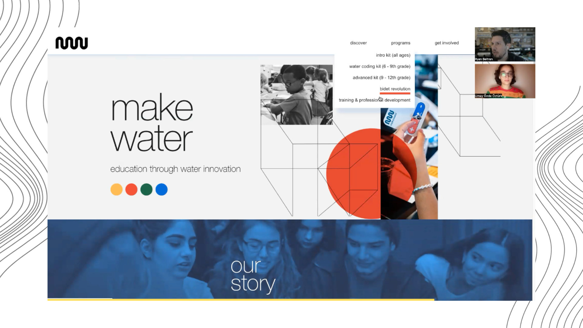
A Closer Look: MakeWater's Website Makeover

Don’t have time to read? Watch the full interview here.
Welcome to "A Closer Look: MakeWater's Website Makeover," where we dive into the transformative journey of MakeWater's online presence with its founder, Ryan Beltran. In this exclusive interview, Ryan shares the insights, challenges, and aspirations behind the decision to renew MakeWater's website, offering a behind-the-scenes glimpse into the meticulous process of redesigning a digital platform that truly embodies the organization's work and values.
Q1: What were the primary reasons behind the decision to renew MakeWater's website?
So, we wanted our website to really speak for what we are doing. Obviously, like any website. I'm going to just get technical. We had Squarespace, and then we moved to WordPress. but it was a lot trickier doing the WordPress method for us. So we came back to Squarespace, and honestly, it's just been easier to combine our graphic designer work on our website to make it match our style guide that was made by a really wonderful graphic designer, Travis Spangler.. So we were really happy with just having a website that had this fun, cool style that we kind of have at MakeWater, but also be a resourceful place for our participants, our educators, our students, our collaborators, and our sponsors. It took a while to get there, but we're really happy with how it's coming out.
Q2: Can you highlight some of the specific issues with the old website that led to the decision for renewal?
We wanted our website to be a resource, and it just wasn't there, because we kept focusing on a lot of technical things, where the content would come after the foundation. And the foundation of the site never really got there. So we didn't follow up with a lot of, resourceful, things like about our team, about our program. It didn't really fit and catch up with the narrative of our nonprofit that is evolving. There were a lot of issues like that that we saw were not progressing. It's hard to go from one to another and then come back. But we bit the bullet. We knew we had to. And it was a learning experience and we're better for it because, we wouldn't have had the site that we have now.
Q3: How do you think the renewed website aligns with MakeWater's overall message and narrative that you just mentioned?
The great thing is that we have a blog area that overlaps with our newsletter. So, you're going to get more updates, especially like this. We're going to be doing interviews twice a month. That's our goal, where one's going to focus on how I feel our nonprofit is moving. And then also, like today, we're focusing on a topic, which is the website. And then that's going to go into the blog, via our website, but then also the newsletter. So we have this way to kind of keep sharing and engaging with our educators and participants. And we feel the website is also just going to be more of that. It's going to be a resource. If you're a collaborator, you can come and just get a lot more wealth of knowledge of how you might want to work with us, how our program works, or how our kits work.
Q4: Can you share some insights about the design process as well? Did you want to keep it more minimalistic this time or more graphics? What was the thought behind that?
I think it's a mix of both. So we work with, I mentioned, our original graphic designer for our style guide who helped lay the foundation for our branding, Travis Spangler. He helped us with the foundation, and we've been able to take that, make it into templates, and apply it to social media. And Then we worked with another graphic designer, Andrea Zuluga, who's wonderful at interpreting the style guide and applying it. She's helped us with instruction manuals, with elements like hand-drawn elements. So, a lot of it is her interpretation, and she's done a really good job since she's worked with us for a couple of years. So, we found this balance of some big bold graphic statements sometimes and that happy medium that looks fun and different– but it's resourceful, and you're getting information. I feel like we found a nice balance that kind of makes a statement and makes us different.
Q5: In what ways do you see the new website contributing to the future growth and success of MakeWater and the community?
That's a good question because, in the past, we've always wanted to have more resources and showcase our programs, and now we have a section for that. So we have an area where you can see each one of our kits and then have access to different curricula, pamphlets, or instruction manuals. We want to have that all easily accessible. What we had on our last website was very vague and general, but now you're going to be able to go in and learn so much more. Also, the students and educators can add things. So it'll evolve with the community that'll be accessible. Another addition is the Bidet Revolution Program that we're piloting is on there, and also, a big new thing that we're doing now is Professional Development. So there's a section specifically for that. We will try to see how to integrate upcoming professional development events and how you can participate in that or maybe even see if you want one locally. If we can try to accommodate that so that teachers can get professional development hours or credit hours. We think there's just this really great overlap for that program. And now we have a section to explain that. And then we have how can you get involved area. that kind of is for collaborators, volunteers, educators, but also sponsors or donors. We want it to be a way where if you come in and you want to participate, you have a place to start and see where you fit in. These are all some great additions to the site that we're excited to have live now on the site.
Q5: Do you have any suggestions for other nonprofits with similar challenges, such as getting the message across or having their message be too vague?
I think you have to get fresh eyes on your content sometimes. Ask people to ask you questions about what they don't get. I've sent this to my family, and they'll send me feedback. Try to get honest feedback, but then also go and see the site and pretend you are somebody else looking at this for the first time. How would they navigate it? What might they be asking or not getting? And it's hard because if you're doing this 24/7 and it’s your job, you've been involved in this, then all this stuff is familiar to you, the kits, the program. So you fill in the gaps in your own mind that you may not notice, but a newcomer will. So I would say if you are having an issue where you want your website to be better, just get real feedback from people who are willing to give you honest feedback.
Q6: Do you want to do a sneak peek of the website?